Zurich is the largest city in Switzerland settled for over 2000 years. Located at the tip of the lake Zurich, it mesmerizes visitors and inhabitants with its magnificent landscapes of lake, mountains and rivers. It is a home of numerous museum and art galleries including, but not limited to, Zurich Museum of Art, Swiss National Museum and Centre le Corbusier. On the either side of the Limmat One can find numerous historic sites such as Lindenhof and Imperal Palace. Zurich is also cluttered with dozens of churches, parks and gardens.
Zurich stands out not only with its nature, art and aesthetic qualities, but it is also considered as the hub of Switzerland. Zurich serves as a connection point for railways, buses and airplanes. It is considered as one of the global markets and as an important financial center despite its small size and population.
Zurich counts 400,028 inhabitants in total with around 32% of them not being Swiss citizens. Therefore, the city is very diverse and combines people with different cultures, nationalities and heritage. Since there are several popular universities such as ETH and PHW Business school, Zurich is also home for many talented young people as well as professionals with years of experience, families and retired individuals who want to enjoy every second remaining in their life.
Since Zurich is so diverse in terms of population (ages, backgrounds, nationalities, wealth etc.) and space, some of you may wonder how it is structured. What can we learn from this structure for knowledge transfer or what can we potentially improve for better life in Zurich? To answer these questions we need to identify characteristics and indicators of quality of life and space, study their spatial distribution and connection between indicators. We also need to portray people, their preferences, their life styles. We need to group them and study their groups. Only then, can we investigate indicators and people in one frame, connect groups of people with areas they occupy and search for reasons why. This data story is a bridge between the quality of space and the people who live in the area. This data story, is the story of Zurich. Its people. Its spaces. Its life.
Quality of Space/Life in Zurich
How should we divide/structure area of Zurich to study its characteristics? How can we define quality of life and space for identified areas? What are the indicators we should use?
Regarding the structure logical solution is to consider official postal areas within Zurich. There are 24 different zip codes in total.
To identify indicators we utilized the city of Zurich open database, an online repository containing variety of information ranging from surveys to garbage collection schedules in Zurich.
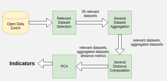
We selected 35 relevant datasets from all the existing datasets that provided information either on zip code level or on geographic coordinate level that we linked with postal areas. We logically grouped some of the datasets (# of facilities per zip code):
- Sport facilities: sum of all of the public sport amenities (pools, soccer pitches, volleyball fields, sports halls, etc.)
- Parks: sum of all the public parks and picnic areas
- Child facilities: sum of all children related facilities (elementary schools, kindergartens, nursery schools, etc.)
- Facilities for the elderly: sum of retirement homes, elderly centers, etc.
- Handicapped accessibility: sum of all handicapped equipped toilets and parking spots for the disabled.
- Community facilities: sum of community centers and youth centers.
- Toilets: sum of public handicapped and non-handicapped equipped toilets
- Transport rental: sum of all points of rental of Mobility cars and of PubliBikes.
We also obtained the population per zip code, using la Poste’s open database. This was used to normalize values and get per person metrics, which are better suited for cross-comparison between zips.
Information regarding the most relevant (groups of) datasets is provided below:
There are 400,028 inhabitants in Zurich in total. Number of Population per zip code ranges roughly from 4000 thousand to 34000. It has to be noted that bigger areas do not necessarily correspond to the higher numbers of population. However, one could say that north west postal areas are the most densely populated
Even though it is useful to know number of facilities per area, sometimes it’s more relevant to have information about accessibility. One way to do this is to find the shortest distance from individual habitations (addresses) to certain facilities. For instance, to measure police accessibility we computed the distance from each address to the closest police location and found the average shortest distance for each zip code. Using this method, average shortest distance to the following facilities were computed:
- police locations
- parks
- hospitality companies
- handicapped facilities
Finally, we used all of the features mentioned above to create 5 indicators. It is difficult to estimate how to combine the above metrics into a meaningful composite score, unless one is an expert. To avoid this difficulty, we used a method based on PCA and inspired by the one used to create socio-economic status indices. In this method, relevant subsets of features are chosen. The data is then normalized for each feature, the mean is subtracted and finally PCA is applied. The first component of the analysis is chosen to create the indicator, which is therefore basically a weighted sum of the normalized features. The variance explained by the first component, was always above 75% for each of the create indicators, which justifies using only one component.
Zurich indicators
(Toggle the legend to display/hide radar plot of certain region)
Safety Score
We estimated safety indicator/score using street light counts in combination with number and shortest average distance of police locations using PCA. The best result was obtained weighting street lights and number of police locations by 0.87 and 0.1 respectively (positive influence), whereas distance was weighted by -0.49 (negative influence). The further the shortest average distance is, the smaller the score will be.
The visualization above displays score for each zip code. One can select any subset of postal areas for further exploration. We observe, that 8001 zip code has significantly better score (0.71) than any other area. Since it is the old town part of Zurich, it seems logical that safety is emphasized and there are more historical police locations. However, this score can be seen as an outlier considering that the maximal score for other postal areas is 0.3.
Hospitality Score
In order to computer hospitality indicator, we used number and shortest average distance to hospitality facilities of our data. As expected, the final score is negatively influenced by distance (-0.29) and positively (0.96) by number of facilities. Again, 8001 postal area is an outlier, that can be explained by its touristic value or biased sampling, since hospitality facilities in that area might be better known.
Accessibility score
Regarding accessibility score, we utilized aggregated handicap dataset together with shortest average distance to it. In this case, score gets penalized harder than in previous cases, when distance is long (-0.76). This is a desired property, since number of facilities make no difference, if it’s cumbersome to reach one.
Parks
To estimate parks/green are score, we used aggregated parks dataset with shortest average distances. In this case, distance has relatively small influence (-0.07), whereas number of parks is weighted by 0.1.
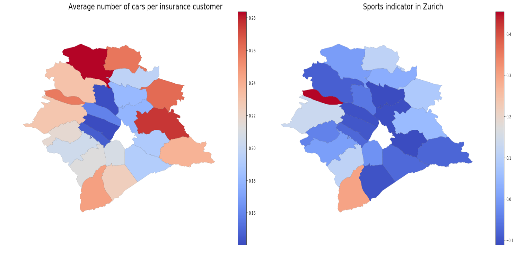
Sports Facilities
In order to obtain the score, we normalize the number of sport facilities dataset by the total number in Zurich. Mean is also removed.
Population in Zurich
Portray people, their preferences, their life styles in Zurich. Group them and study their groups.
To characterize the people of Zurich, we would need access to census data, which is hard to obtain. However, the EPFL HERUS lab, kindly provided us with access to a dataset regrouping information about insurance customers from La Mobilière. Thanks to this, we were able to get valuable data regarding the people of Zurich, with a very decent sample size. Using insurance data to characterize population is an approach, that despite its bias, was successfully used in the approximation of population sample in previous research.
The Swiss Mobiliar dataset is a private collection of anonymous insurance data, that groups information about clients, their demographics and properties. Among all the data, we decided to focus on some that are relavant to our study: status of employment, civil status, gender, year of birth, if house is owned or rented, communication language, nation of origin, zip code of residence, how many children, price of car, insured sum of house, standard of furniture, number of rooms in house.
There are around 1M entries in the Swiss Mobiliar dataset, however when narrowing down to the zip codes of Zurich, the number of entries is reduced to around 50 000. Again, due to the naure of the data, there is an obvious bias. For instance, take a look at the age distribtion of our sample. It can nevertheless be used to get insight into Zurich’s populaion.
After data cleaning, we aggregated the data according to the zip code area that customers live in. For categorical data, we looked at for each zip code area and compared to Zurich in general, the percentage of resident falling in each category. For numerical data, we found the average (e.g. average age, average number of children).
Categorical data exploration
For the categorical data (eg. job state, civil state, nationality), we aggregated the information into the percentage of each cateogry at zip-code level. The following is a heatmap visualization of the data.
From the plot, we can see that most of the population is employed. In each of the area, there are at least 50% of the residents that have jobs. Residents living in zip code 8003, 8005, 8055 have the highest employment rate, reaching about 75%. There is also about 10% retired residents in each area.
For civil status, we observe that most of the population is single (more than 40% in each area) and there are about 20% in each area that are married. We also observed that the areas that have a high employment rate also have a high single rate.
When it comes to gender, each area has roughly a 50/50 split which follows the natural population distribution.
The data suggests that most of the population in Zurich are renters, which might be related to the high property cost of Zurich. The zip code area 8053 has both a high percentage of retired residents and property owners, which seems to fit the intuition that people tend to have their own property later in their life.
For each of the areas, German is the dominating language and Swiss is the dominating nationality. However, we can observe that some areas like 8048, 8050, 8051, 8052 have relatively large proportion of immigrants (about 30%).
Linking the people to the city
Investigate indicators and people in one frame, connect groups of people with areas they occupy and search for reasons why.
Now that we have constructed metrics that characterize the city and obtained information about its citizens, we want to link the people to the area that they live in, and understand what are the factors that lead to them living there. We have gathered a lot of features and metrics so far, and there is a lot of information to be extracted. We chose to focalize our spatial analysis to a few points that really stand out. To reveal these elements, we first examine which features correlate to each other. The following heatmap shows the Pearson correlation coefficient between all of the indicators and some mean insurance data features (aggregated to zip code level). The 8001 postal area is an outlier. Being the historical center, it is very well equipped and dense in terms of buildings, hospitality companies etc. It will be removed in this analysis.
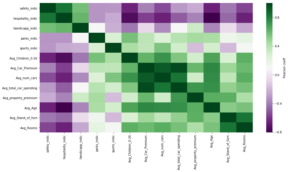
Some remarks concerning this heatmap:
- All of the mean insurance customer metrics seem to be positively correlated together. This should be expected, as older customers should earn more, have more cars and larger houses on average.
- Some of the city indicators are positively correlated together. For instance the safety indicator seems to be quite strongly positvely correlated to the hospitality one.
- We see some counterintuitive behavior: the average number of rooms is strongly negatively correlated to the safety indicator. Upon further analysis, and when considering how the safety indicator was constructed, it seems that this safety score is actually measuring proximity to the center. The majority of the police locations are situated in the center of Zurich, and the number of street lights follows a similar pattern. This does not however mean that the suburban postal areas are less safe.
We then focus on a few highly correlated elements, while being aware of the above remarks.
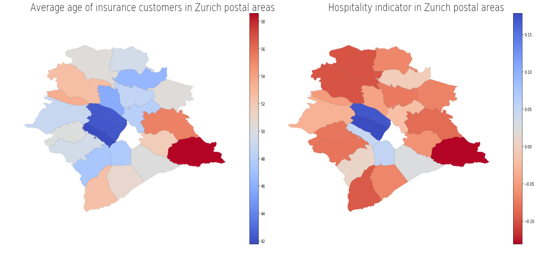
Young people tend to be in areas with more hospitality companies (bars, cafés, etc.).
Average age correlates with hospitality indicator with r= -0.80 and p-value= 4e-7.
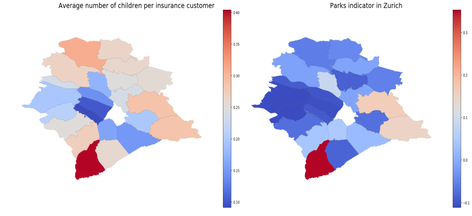
People with more children tend to live further away from hospitality companies and closer to parks.
Average number of children correlates with hospitality and parks indicators with r= -0.75, p-value= 4e-5 and r= 0.57, p-value=5e-3 respectively.
People with more cars seem to live in areas with less restaurants and more sports facilities.
Average number of cars correlates with hospitality and sports indicators with r= -0.66, p-value= 5e-4 and r= 0.55, p-value= 6e-3 respectively.
In general it seems that the wealthier you are, which in general means that you are older and have more cars and a bigger house, the more you live on the outskirts of Zurich, in areas with less cafés, restaurants etc. To mathematically back up this claim we choose to look at the spatial autocorrelation of wealthy people, i.e. we ask the following the question: is there a pattern to the spatial distribution of the wealthy? We can answer performing a spatial analysis using Moran’s I.
Moran’s I is a measure of how spatially autocorrelated a variable is, and can be easily implemented using the PySAL package. For the average property premium of insurance customers in Zurich, we find a Moran’s I of 0.46, with a p-value of 0.001. This indicates that there is indeed a pattern to distribution of the wealthy. What then is that pattern? Using PySAL’s Local Indicators of Spatial Association (LISAs), we can determine spatial clusters. This is shown in the map below.
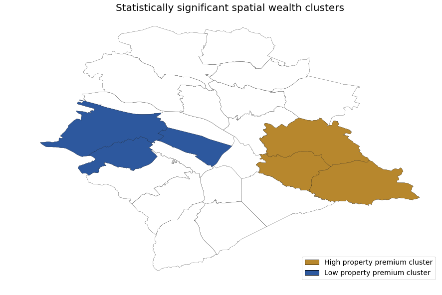
Surprinsingly, instead of seeing a difference between inner and outer Zurich postal areas, we instead observe a contrast between the eastern and the western postal areas.
Conclusion
What can we learn from this structure for knowledge transfer? What can we potentially improve for better life in Zurich?
As seen on the indicator radar plot, some Zurich postal areas could improve their accessibility. It seems like many of the facilities equipped for the disabled are located in the historical area of Zurich, other areas could be improved. Some disparity in wealth distribution was observed. Relatively wealthy and poor areas were identified, which could be helpful for future city planning. For instance, measures pertaining to employment creation could be favorized in the less wealthy areas. The number of young adults is also associated with an increase in the number of bars, cafés etc. Interestingly, these hospitality companies seem to correlate with a decrease in the number of families. This is also important knowledge for city planners, since for instance an imbalance could contribute to wealth clustering.
What could we do to improve this study?
Concerning spatial characterization, some indicators do not seem to behave as desired. Incorporating into their construction more data concerning factors such as unemployment, crime rate, etc, would be desirable. Additional indices measuring quality of life/space could also be constructed. With regards to population, a bigger, more representative sample could also improve this study.
Acknowledgments
We would like to thank Prof. Binder and her lab, the Laboratory for Human-Environment Relations in Urban Systems (HERUS), for supplying us with not only access to the dataset, but also with help and advice. In particular, a special thanks to Emanuele Massaro for setting up the access and for his guidance on a number of issues.